Announcements
Love & Faith Christian Fellowship
Client
Category
Digital Design
Project Summary
This is a sermon series design I created for Love & Faith Christian Fellowship Church in Greensboro, NC. Since castles aren’t something we often see today, I used the New York City skyline to help convey a modern interpretation of “kingdom.” The bold typography was intentionally chosen to reflect the sermon title.
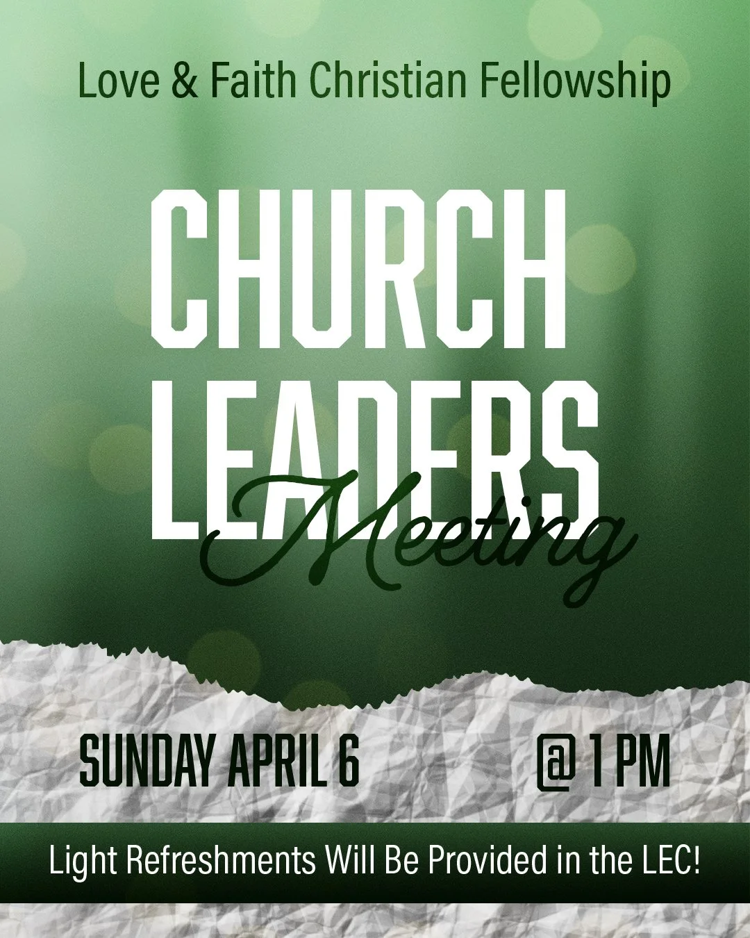
Below are additional samples of designs I created for Love & Faith’s sermon series, Bible studies, and various church announcements.
Image Copyrights: Pexels.com & Love and Faith Christian Fellowship
Rack Cards
Print Design
Client
Ribbons Physical
Therapy
Category
Project Summary
Ribbons Physical Therapy, LLC is the only outpatient rehabilitation clinic in the East Tennessee region dedicated exclusively to treating cancer survivors and lymphedema patients. Based in Johnson City, Tennessee, they specialize in highly focused, compassionate care. I had the privilege of interning with them during my final semester of college.
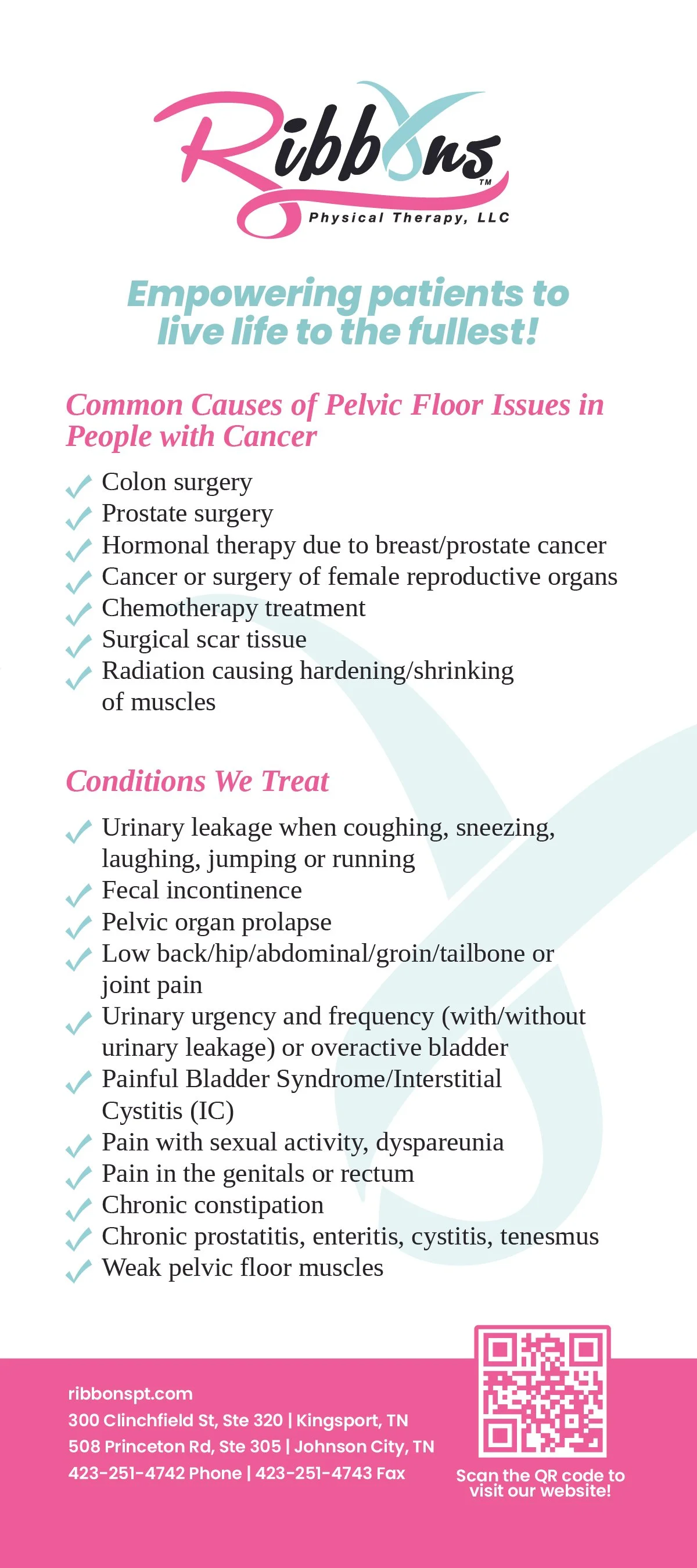
This medical rack card—and the ones shown below—are just a few examples of the many materials I designed for them. It was an invaluable experience working with professionals outside the classroom, where I gained insight not only into design but also into the realities of cancer care.
Album Cover
Category
Client
Class
Print Design
Project Summary
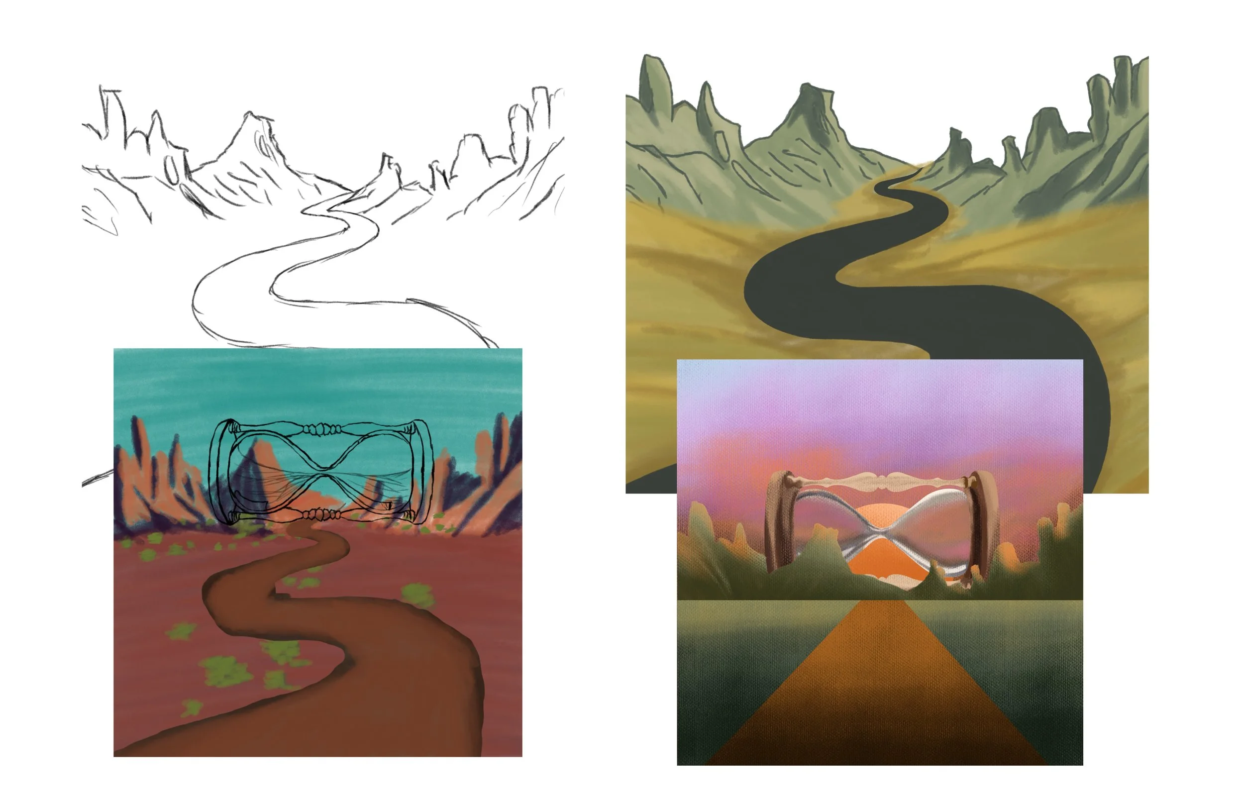
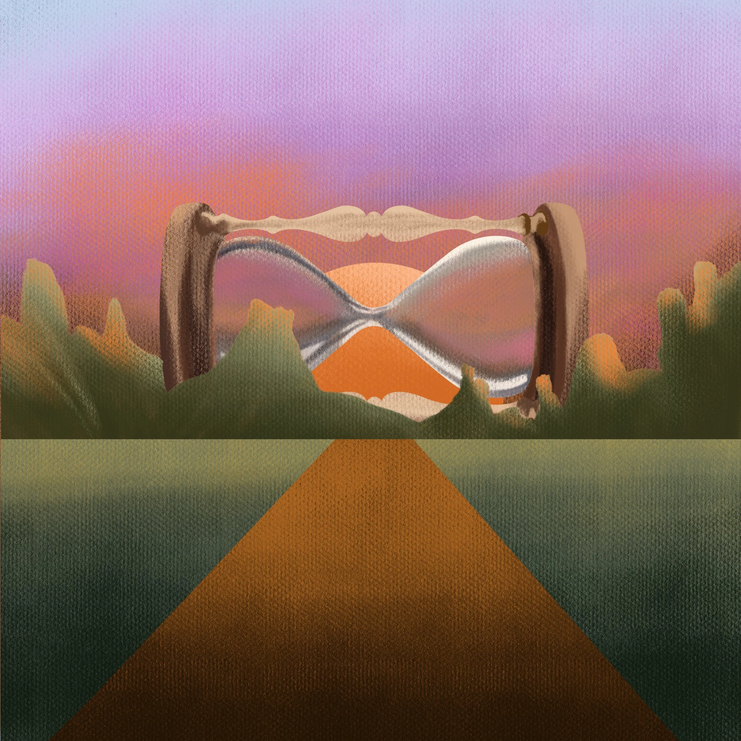
This project was part of my Digital Illustration II class in college. The assignment was to redesign an album cover for one of our favorite albums—I chose Timeless by Nigerian artist Davido. While the original cover isn’t bad, I felt it didn’t fully capture the nostalgic tone of the album. Its composition felt too busy, and the upright hourglass didn’t quite convey the idea of something being “timeless.”
In my version, I used a sideways hourglass to break from convention and suggest a suspension of time. The road leading into the mountains and sunset evokes a sense of reflection and journey, while the pastel color palette brings out feelings of calmness, serenity, and joy. I also placed the artwork on a canvas-textured background to reinforce the sense of timelessness and warmth.
Type Composition
Print Design
Client
Class
Category
Project Summary
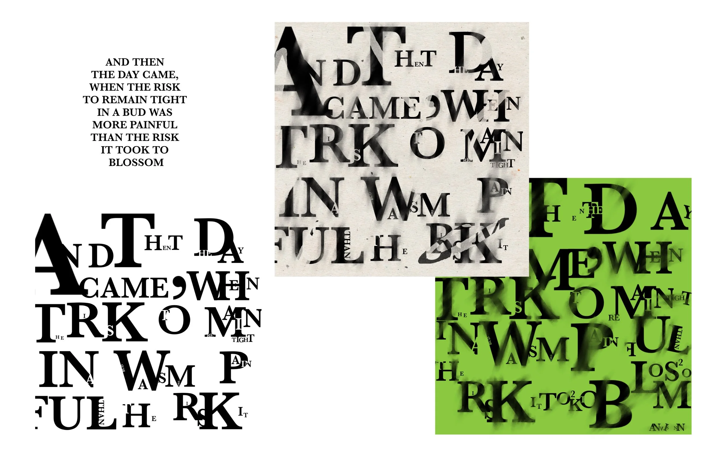
This piece was part of my senior class show at university. Our professor challenged us to create a somewhat abstract artwork using typography, with the intention that each piece would contribute to a cohesive group installation. I chose a powerful quote by Anaïs Nin that resonated deeply with me, as it perfectly reflected the emotions and growth I was experiencing during my final semester of college.
The Phoenix
Milligan University
Client
Category
Print Design
Project Summary
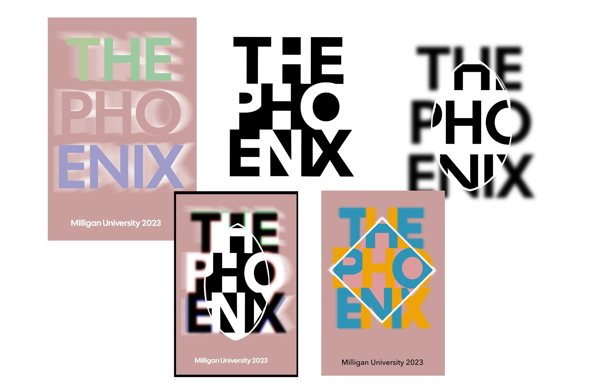
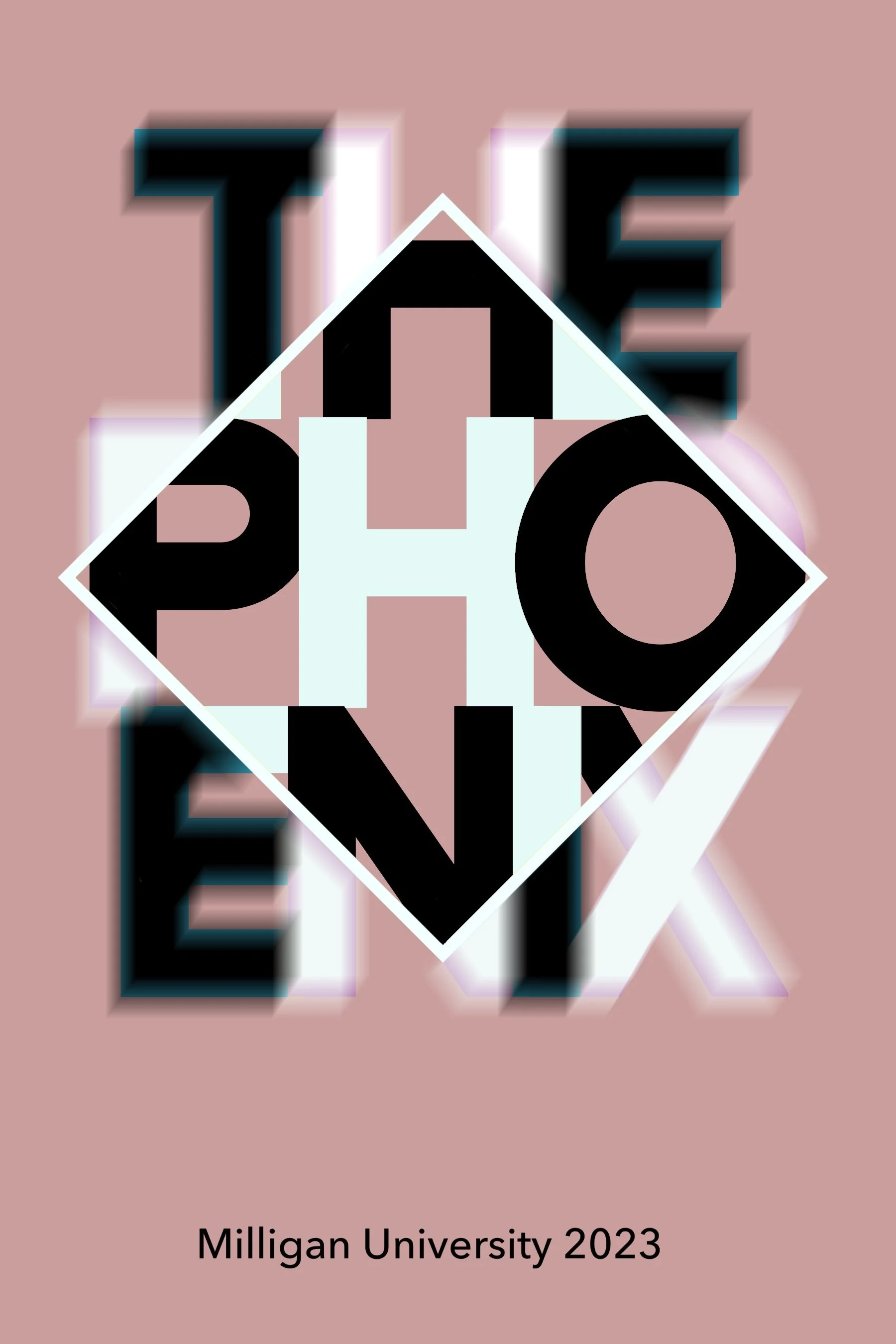
Milligan University publishes The Phoenix, an annual student literary magazine featuring writing and photography from the campus community. Each year, graphic design students are invited to submit cover concepts featuring the publication’s title. The final selection is made by the professor and the magazine’s editor. For Spring 2023, my concept was chosen.
The theme that year was “Memory.” I was drawn to the idea that memories are rarely clear or linear—they overlap, blur, and sometimes even become distorted over time. With that in mind, I chose to visually interpret memory as something intricate and messy, yet still beautiful. I placed the typography tightly together with intentional overlap to convey the layering of memories. A square with a subtle blur effect marks the center—representing recent, clearer memories—while the outer edges symbolize older, less distinct ones. The color treatment enhances this concept: the center is rendered in black and white to suggest clarity, while the edges use layered, superimposed colors to evoke complexity and fading.
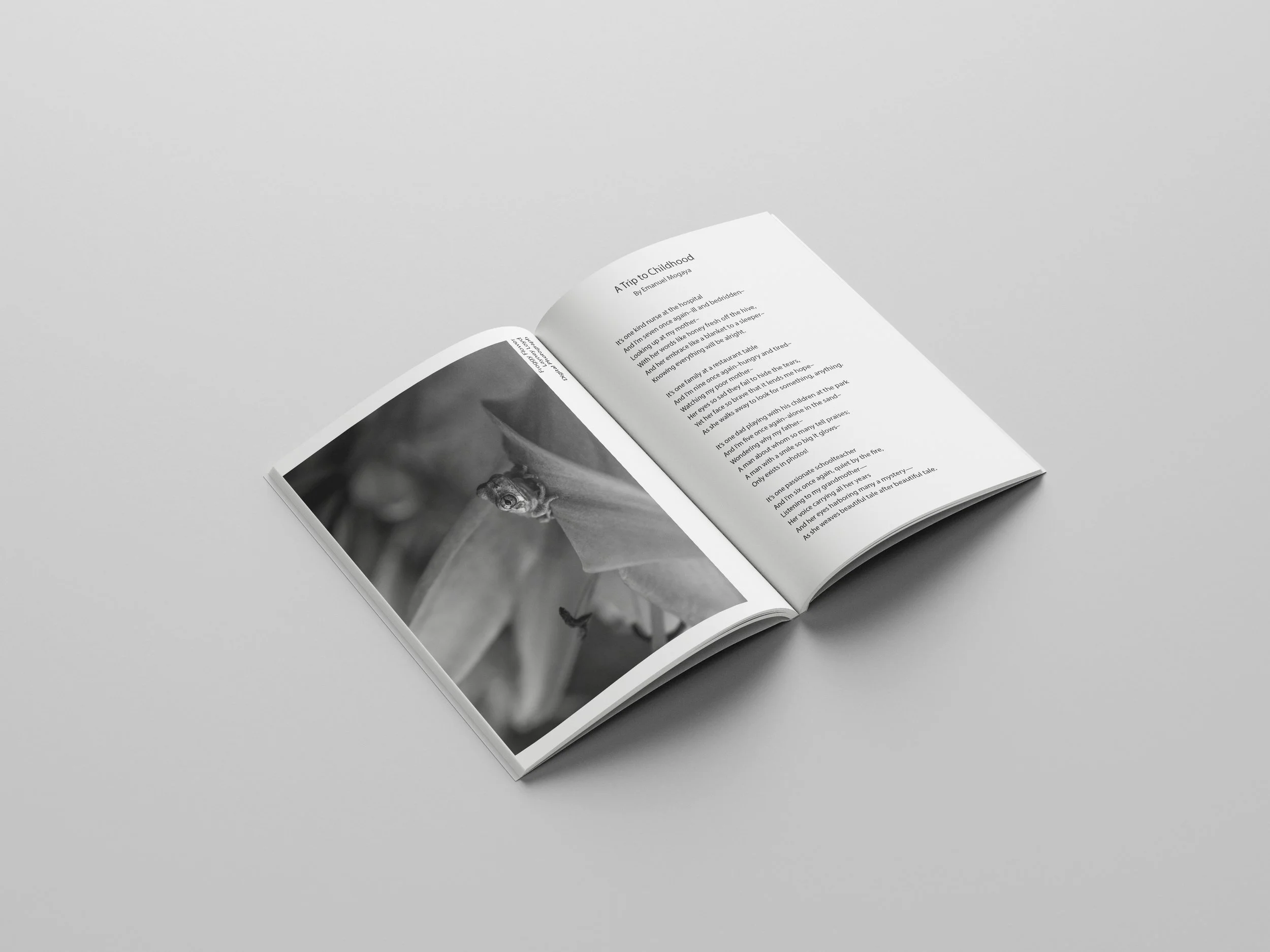
In addition to designing the cover, I worked on the interior layout and prepared the publication for print, which gave me valuable hands-on experience in editorial design and production.
The Hate You Give
Print Design
Client
Class
Category
Project Summary
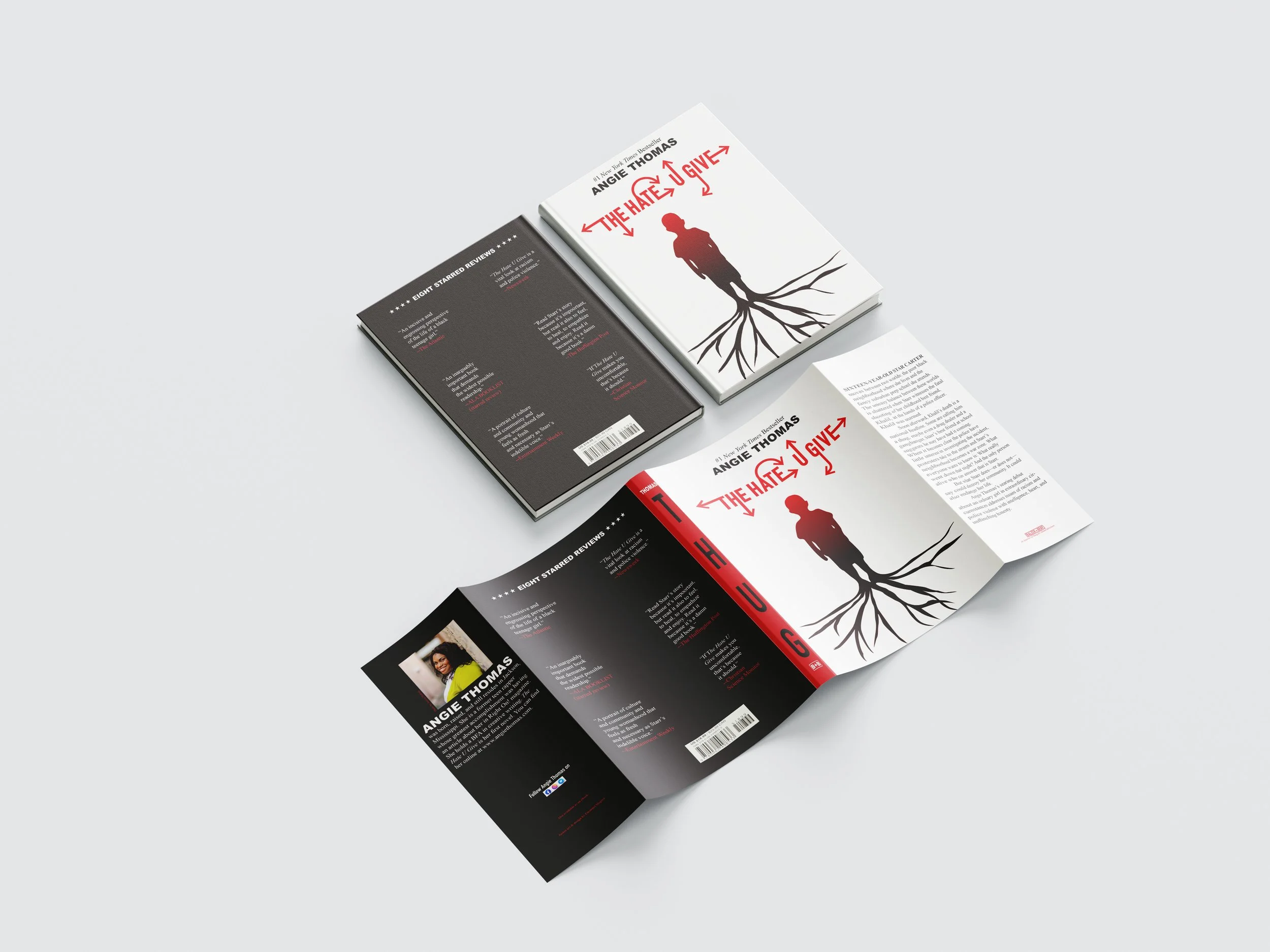
Each year, the Milligan University Library hosts an event to raise awareness about book banning in schools. As part of the initiative, the library partners with graphic design students to reimagine dust jackets for books that have appeared on banned books lists.
In Fall 2022, I redesigned the dust jacket for The Hate U Give by Angie Thomas. I approached the project by interpreting the deeper meaning behind the title. Roots extending from the figure’s feet symbolize how hate can be ingrained from childhood and carried into adulthood. The red gradient around his shoulders and head represents how that hate intensifies over time. Arrows extending from the title illustrate how hate moves in all directions—shaped by and shaping the world around us. I also chose to abbreviate the title on the spine as "THUG" to emphasize how hate can lead to harmful labels and reinforce stereotypes.
This project allowed me to explore symbolism, visual storytelling, and social commentary through design—and I found the process both creatively challenging and meaningful. The Hate U Give is a powerful read that continues to resonate.
Beauty
Client
Class
Category
Print Design
Project Summary
This project was a collaborative effort from my Advanced Graphic Design class, centered around the quote: “The desire for beauty is something that's in us, and it's not trivial” by Stefan Sagmeister.
I especially enjoyed stepping away from the screen and working with physical materials. Inspired by digital masking techniques used in software like Photoshop, I recreated the effect using a fully hands-on approach. I traced the letterforms onto cardboard, cut them out, and layered real leaves over each shape—then trimmed the foliage to match the contours of the letters. I intentionally avoided digital methods for this assignment because I believe beauty first begins in the natural world. Finding tactile, non-digital solutions to design challenges is something I find both rewarding and creatively energizing.
Zephyr Magazine
Class
Client
Category
Print Design
Project Magazine
This magazine was created for my Publication Design class in Spring 2021 and stands as one of my earliest design projects. The assignment was to develop a magazine concept from scratch—including naming the publication, designing the cover, and creating the interior layout.
As someone still new to graphic design at the time, the project came with a learning curve, but it was an exciting and valuable experience. I used a self-portrait for the cover and included a selection of photos featuring some of my friends throughout the inside pages. This project helped lay the foundation for my understanding of editorial design and visual storytelling.


