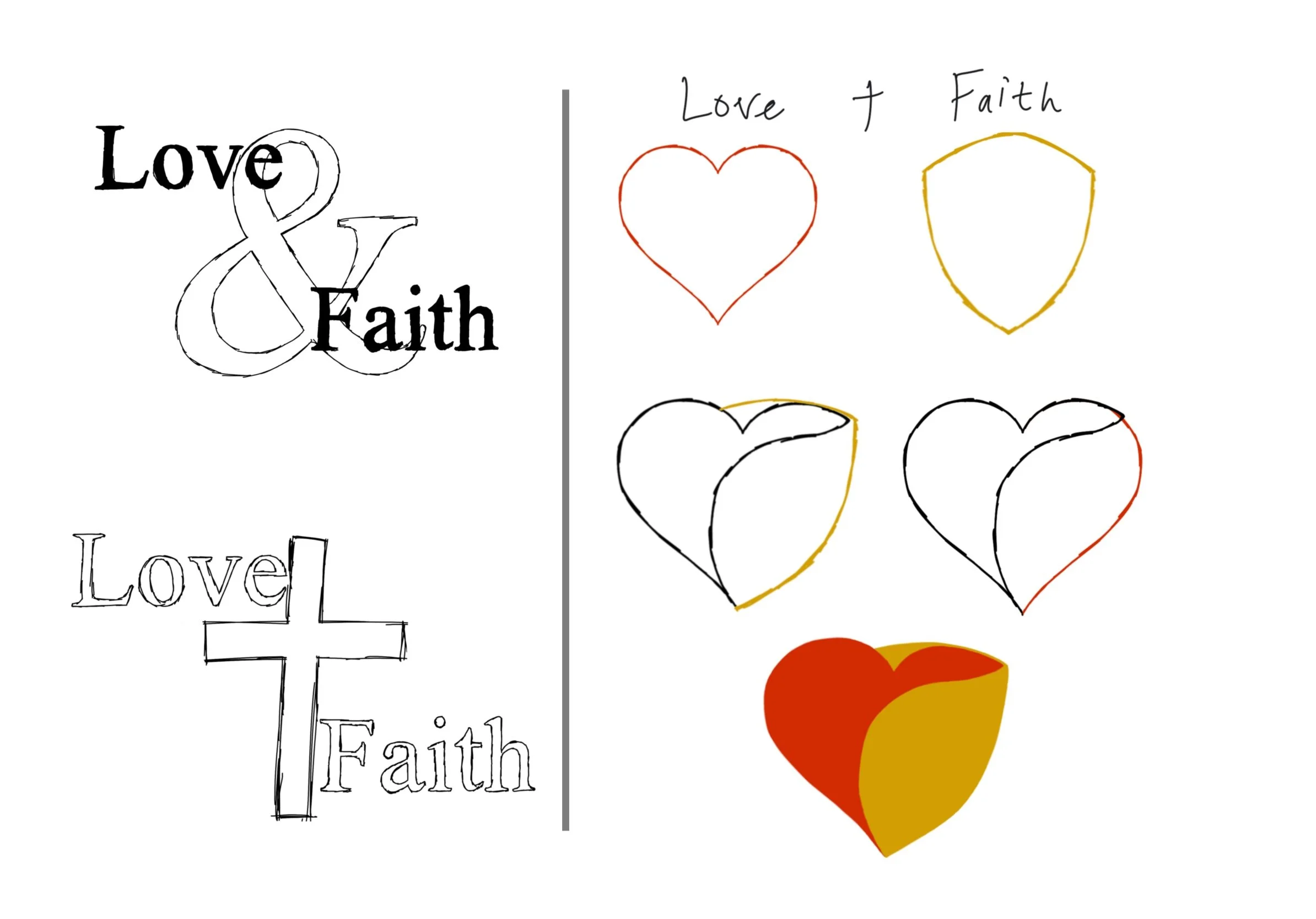
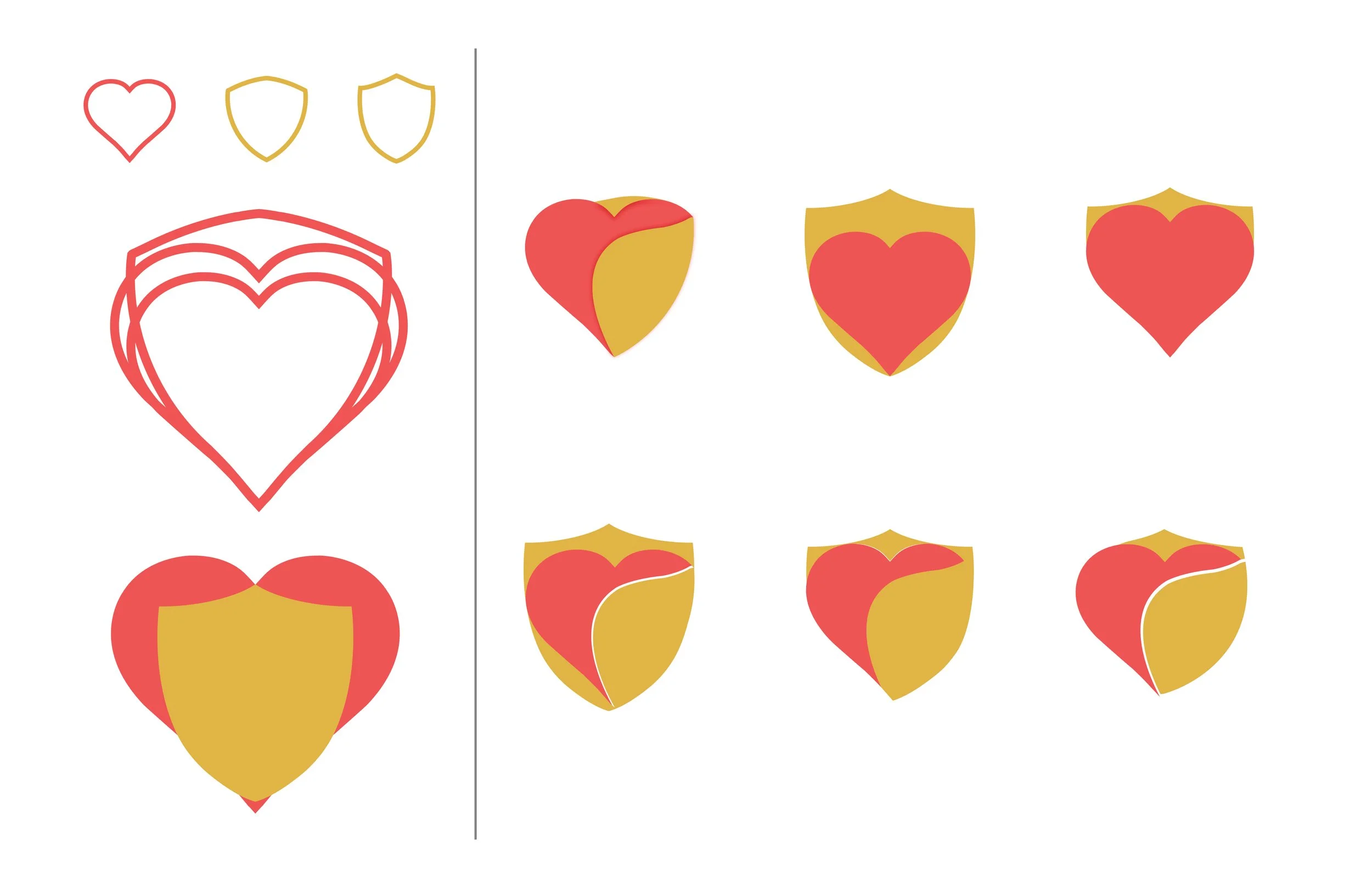
Love & Faith
Client
Love & Faith
Christian Fellowship
Category
Logo Design
Project Summary
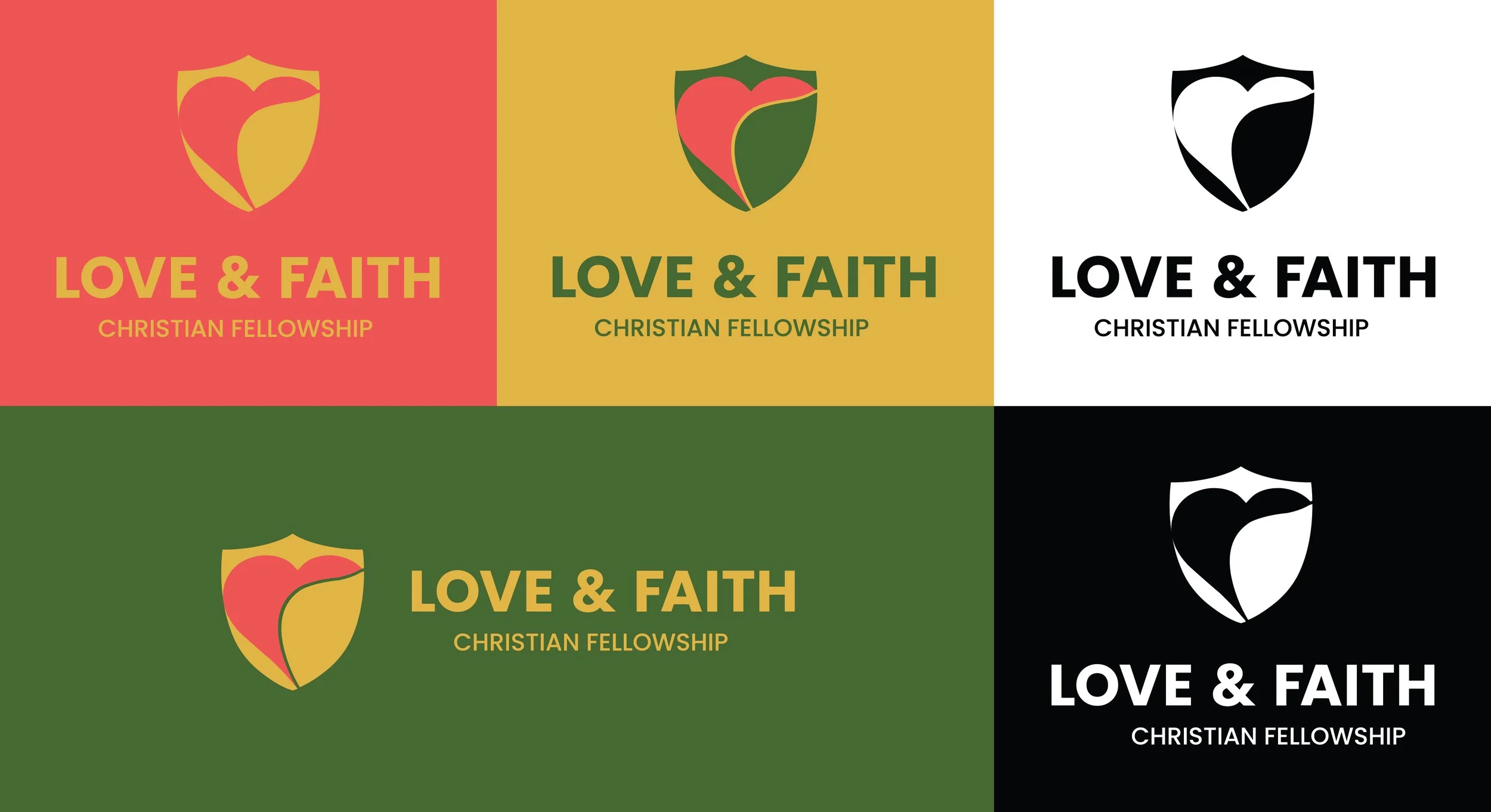
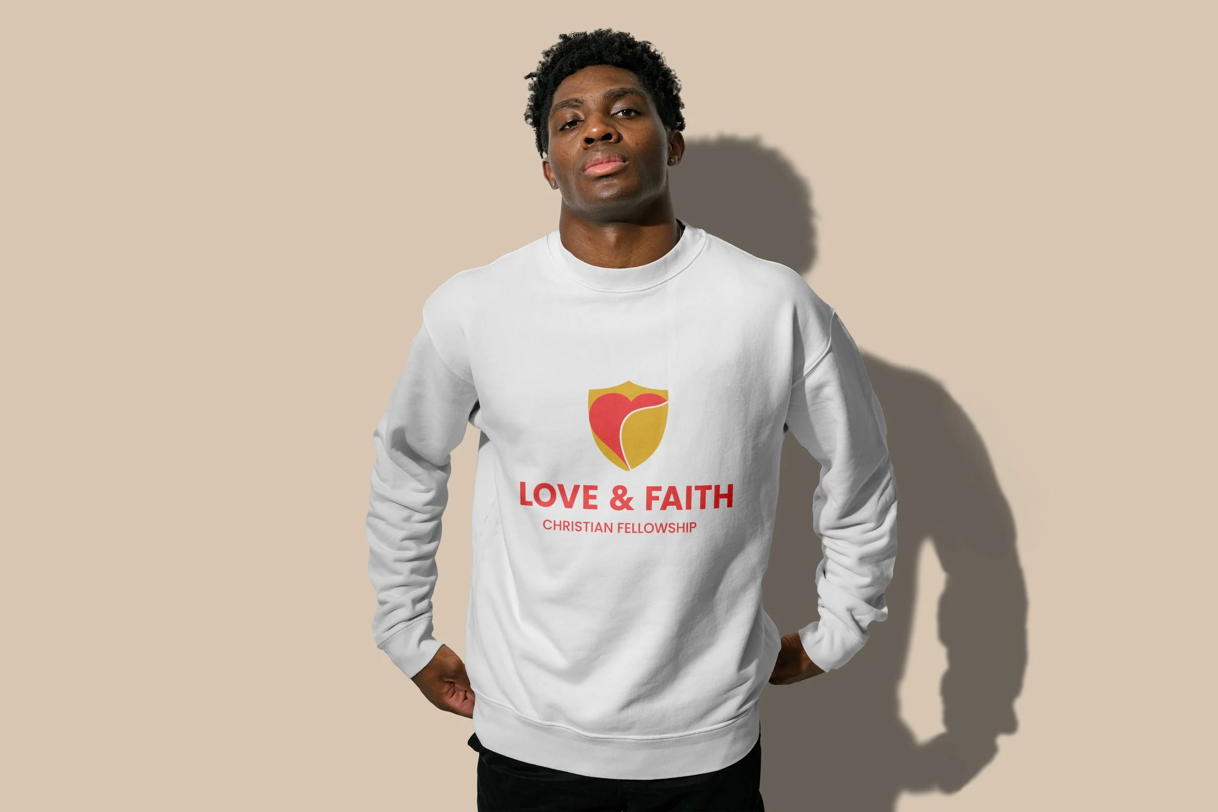
Love & Faith Christian Fellowship is a church based in Greensboro, North Carolina. I created this rebrand proposal to help refresh their visual identity. Their existing logo felt a bit outdated, so I aimed to give it a more modern, clean, and memorable look while still honoring the heart of their ministry.
The main icon is comprised of a heart and a shield. The heart and shield are combined to be as one to show their relationship with each another, as well as for simplicity. The shield wraps around the heart to clearly elaborate the nature of faith. The colors reflect warmth, energy, and prosperity. There’s a version with the color green for growth. The heavy san-serif weight of the logotype reflects the boldness of both love and faith.


What’s the Answer?
Client
Love & Faith
Christian Fellowship
Category
Logo Design
Project Summary
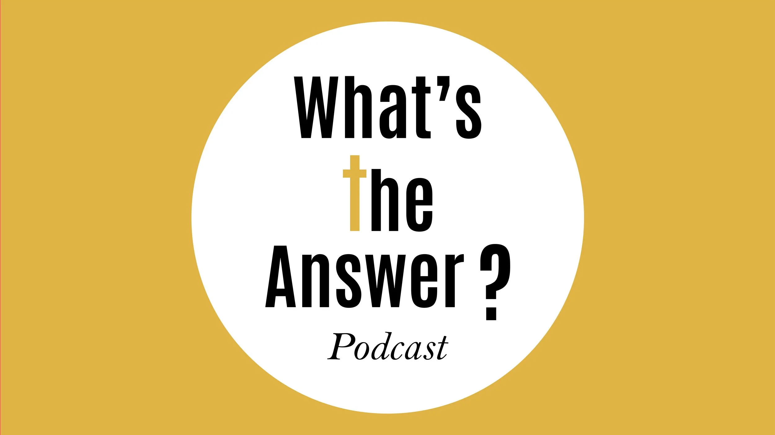
I created this logo for Love & Faith’s podcast. Their old logo was simply outdated. Here again, I aimed to give the logo a more modern, clean, and memorable look while still honoring the heart of their ministry.
The star of the show is the type in yellow in the shape of a question mark. It’s also meant to look like a light bulb to symbolize the podcast’s mission: to shed light on God’s Word. The colors are taken straight from the main church logo above. I did two other version (seen below), incorporating the Cross, which is the Answer!

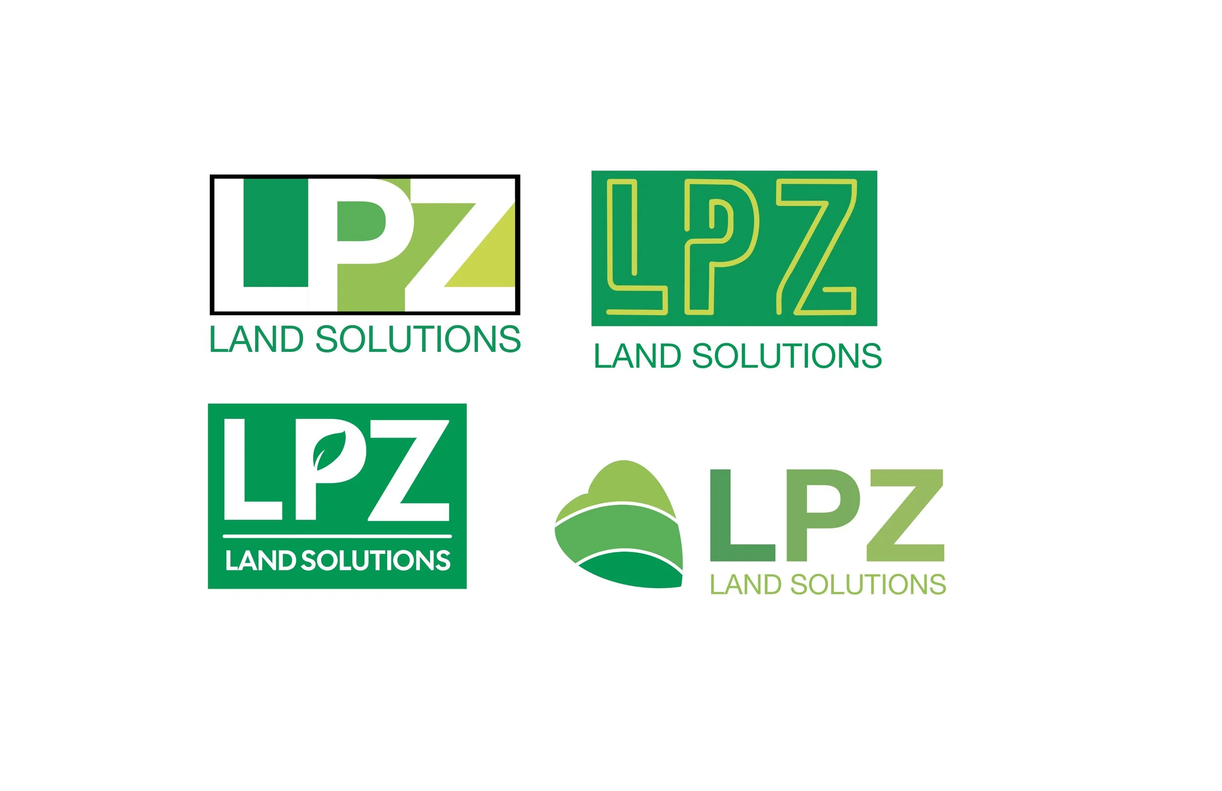
LPZ
Client
LPZ Land Solutions
Category
Logo Design
Project Summary
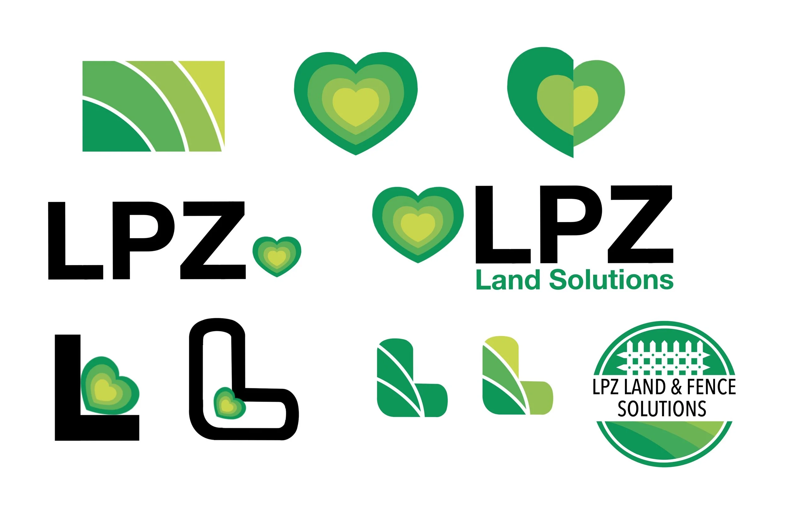
This is a logo concept I worked on for my friend’s dad’s landscaping company. Their old logo was generic and busy (think: a fence, mower, grass, and a sunset), and they wanted to modernize it. They were going for a logo that spoke “quality, detail- oriented, sustainable, reliable, customer-centric, and professional.”
The main icon depicts lawn striping, (from mowing). The colors stand for growth and sustainability, while the heavy san-serif type reflects professionalism and reliability.
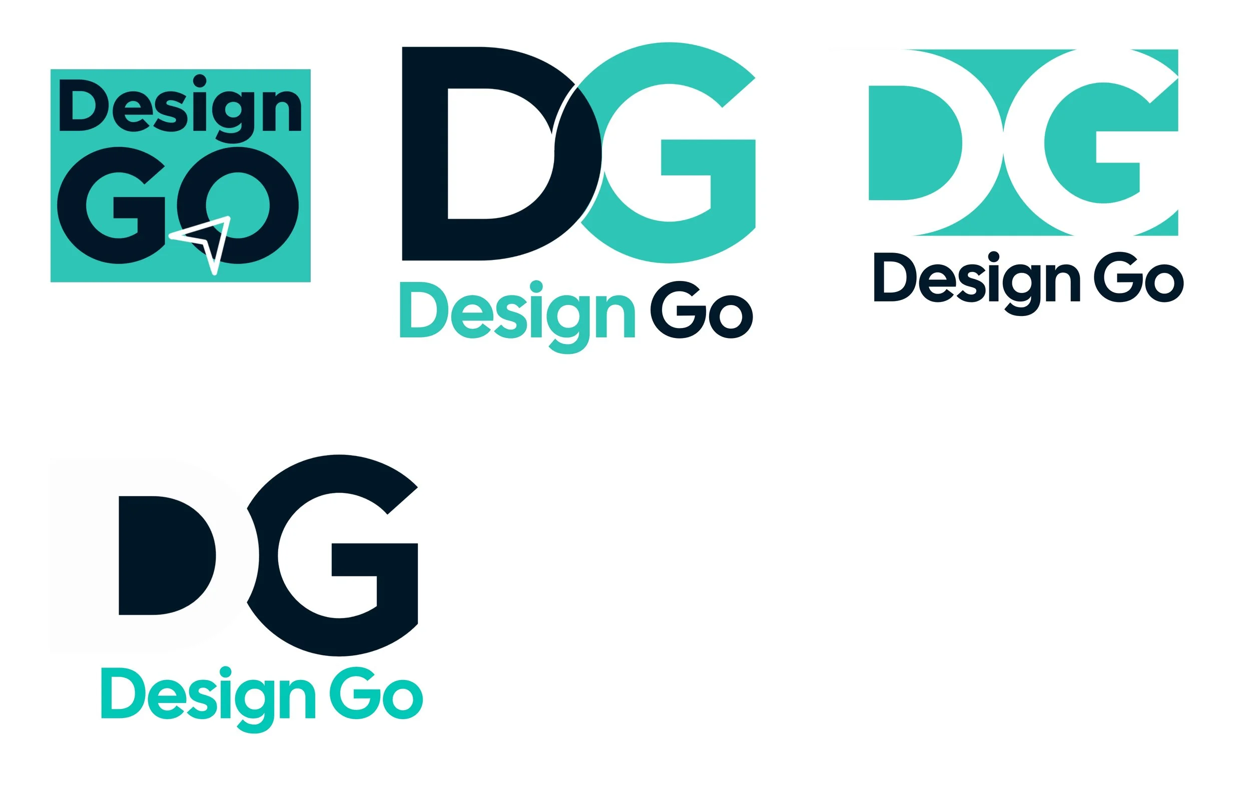
DesignGo
Client
Class
Category
Logo Design
Project Summary
This is a logo concept I developed in my Student Media Agency class. Our professor was looking for branding ideas for the class and asked each of us to explore creative directions beyond just the class name.
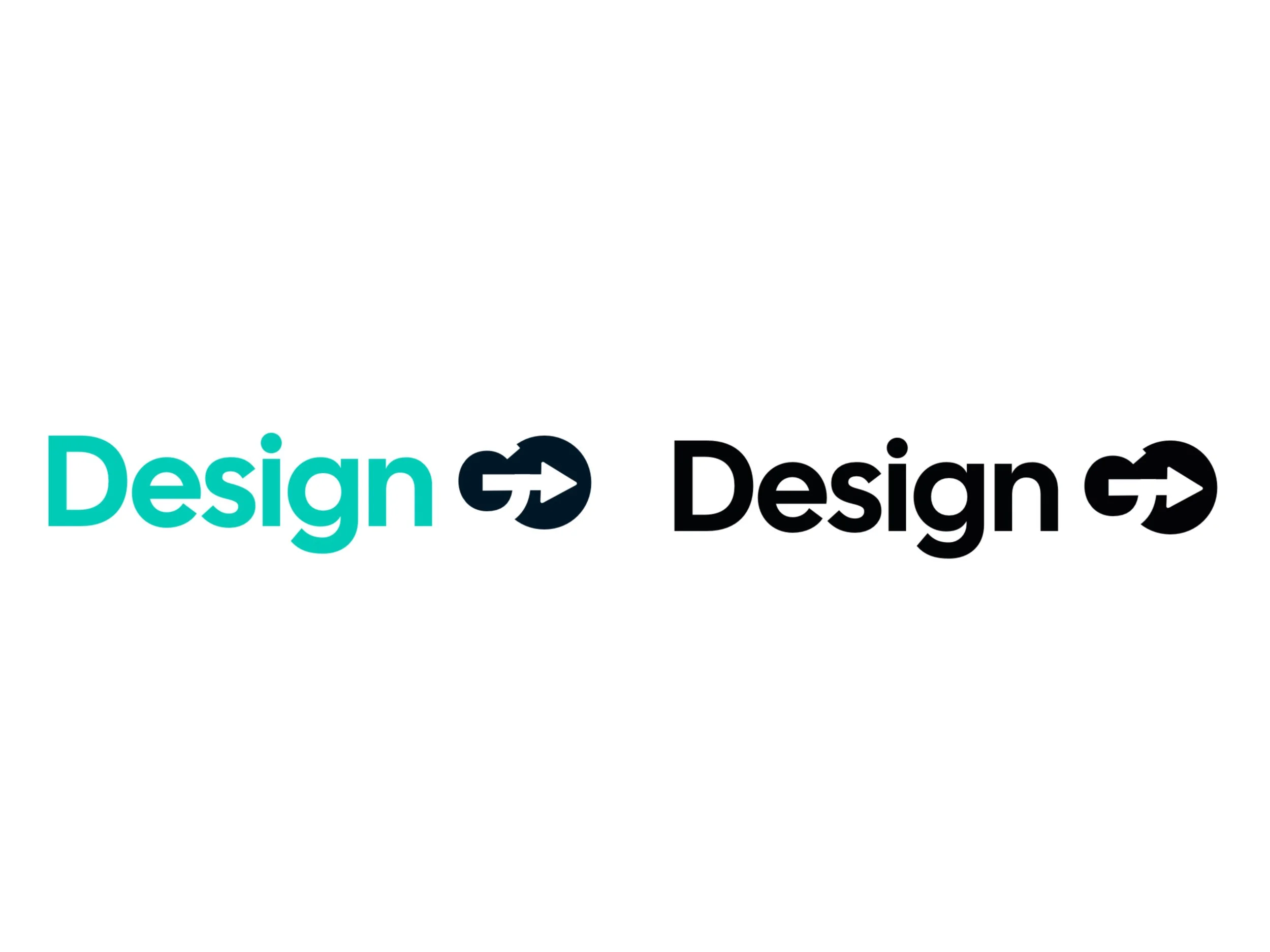
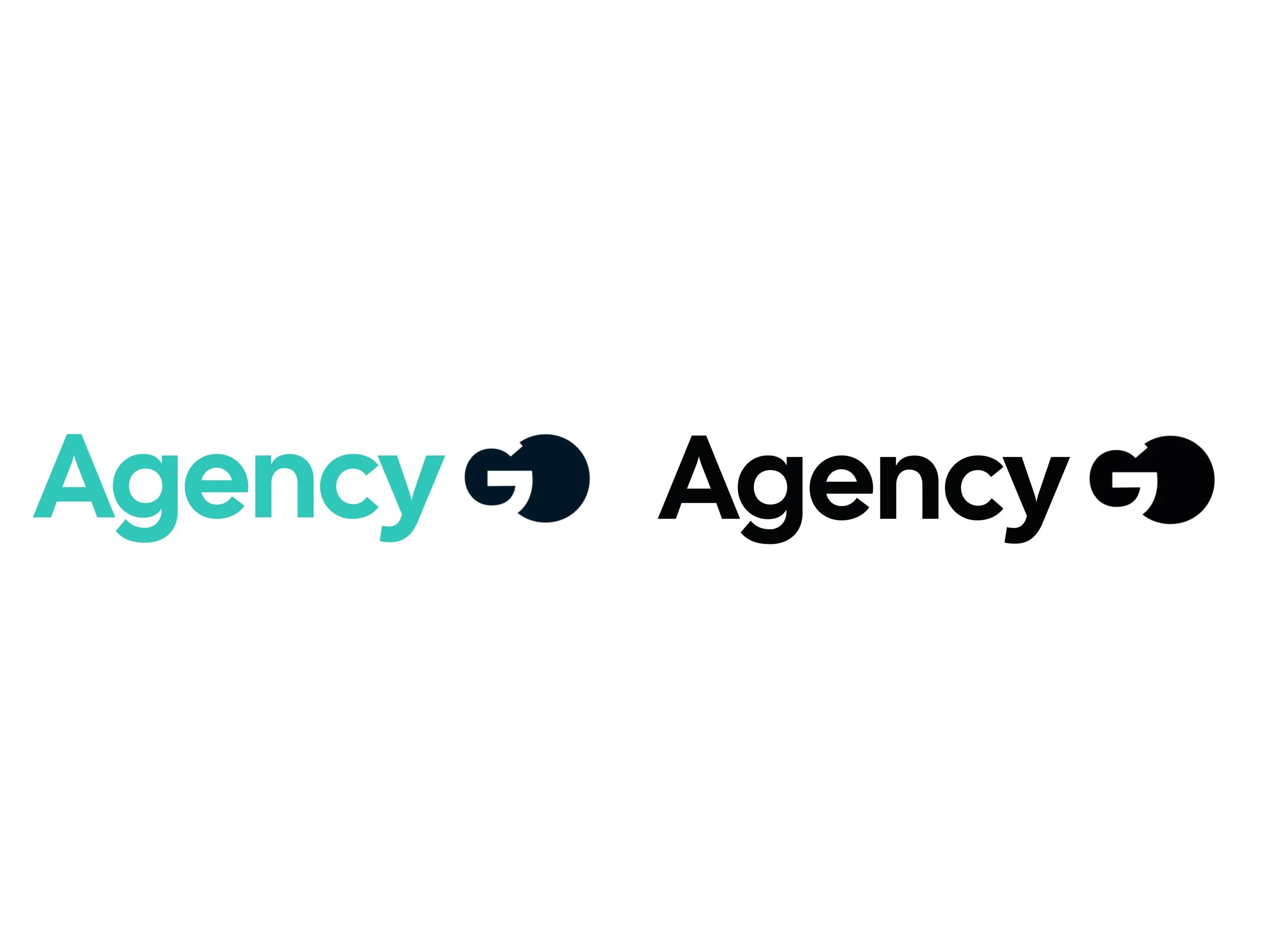
For this first set, I called it “DesignGo” to suggest that the class is a go-to place for creative solutions. Version 1 uses negative space in the word “GO” to give the simple logotype a unique twist. For version 2, I added an arrow to emphasize the idea of forward movement. For version 3, I swapped “Design” for “Agency” to better reflect the broader scope of the class, since not all of the projects are purely design-focused.
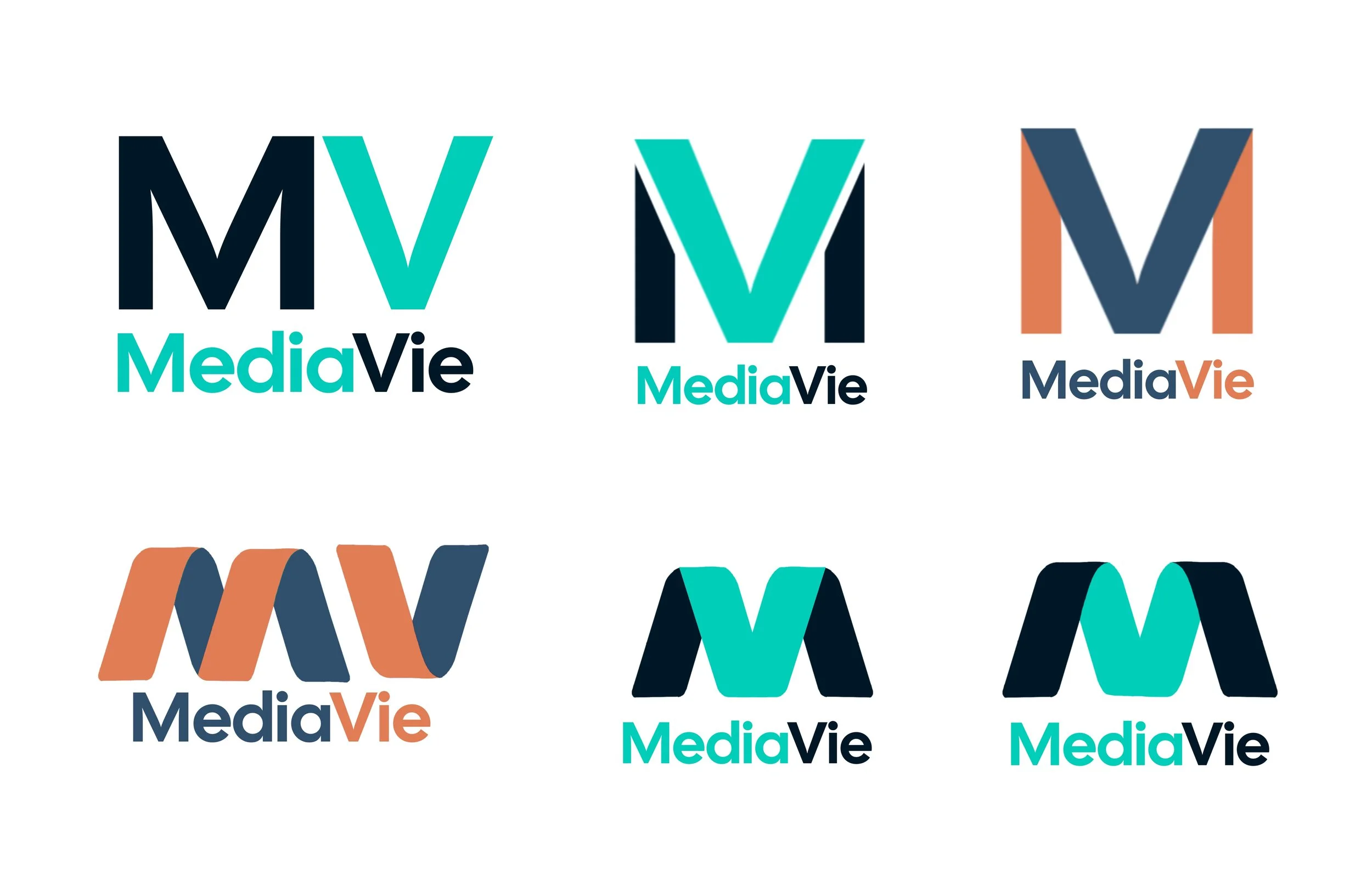
MediaVie
Client
Class
Category
Logo Design
Project Summary
For this second set of logos, I went with the name “MediaVie”—with “Vie” meaning “life” in French. The idea was to represent the class as a space centered around all things media, almost like it has a life of its own. In this logo, and some versions (seen below), the “M” and “V” are merged into a single mark to emphasize the connection between media and life. I carefully chose the color palette to reflect the brand’s personality: orange for warmth and energy; blue for clarity and calm; teal for creativity and freshness; and a deep navy for elegance and modernity.
Studio 460
Client
Class
Category
Logo Design
Project Summary
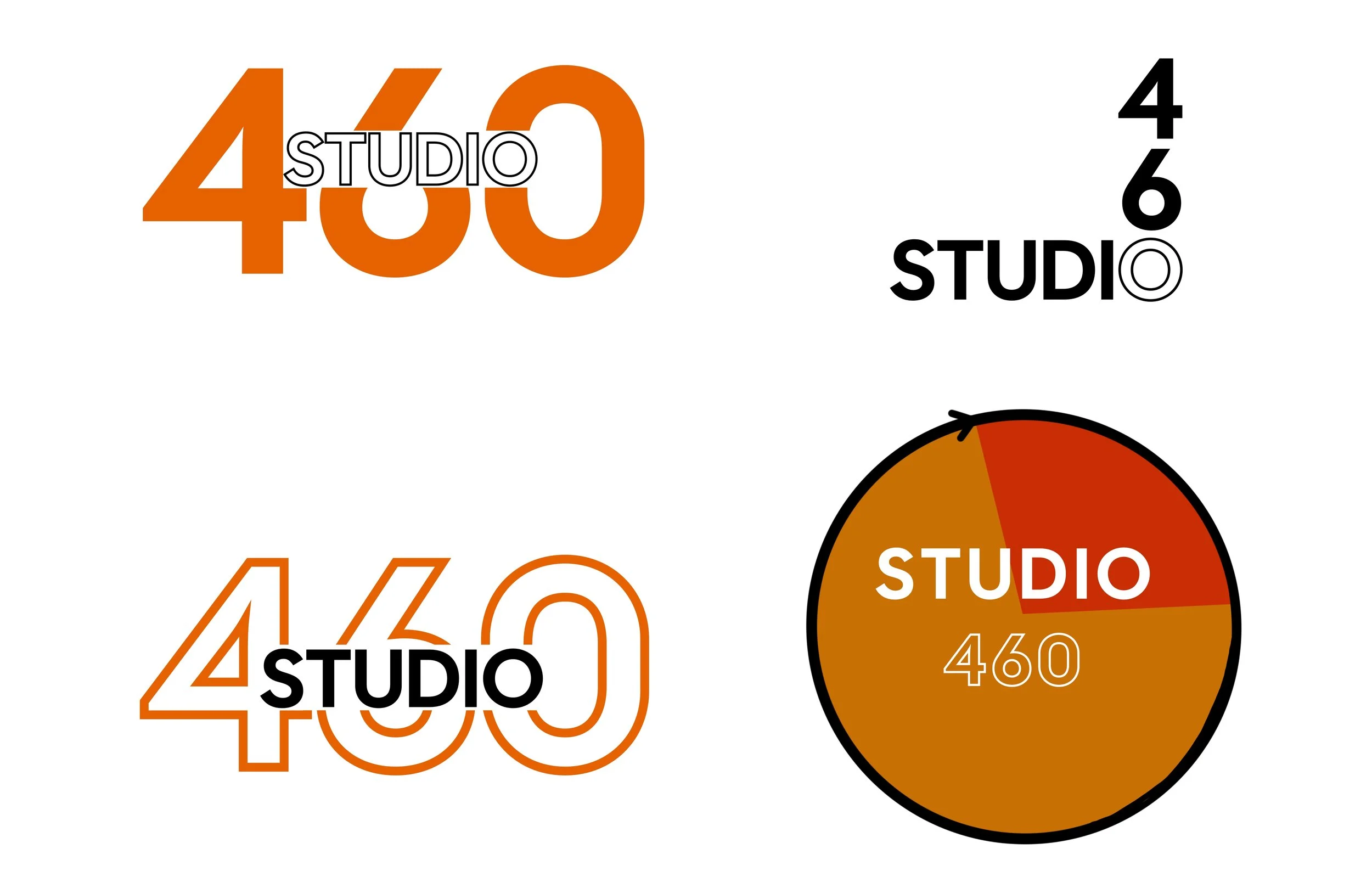
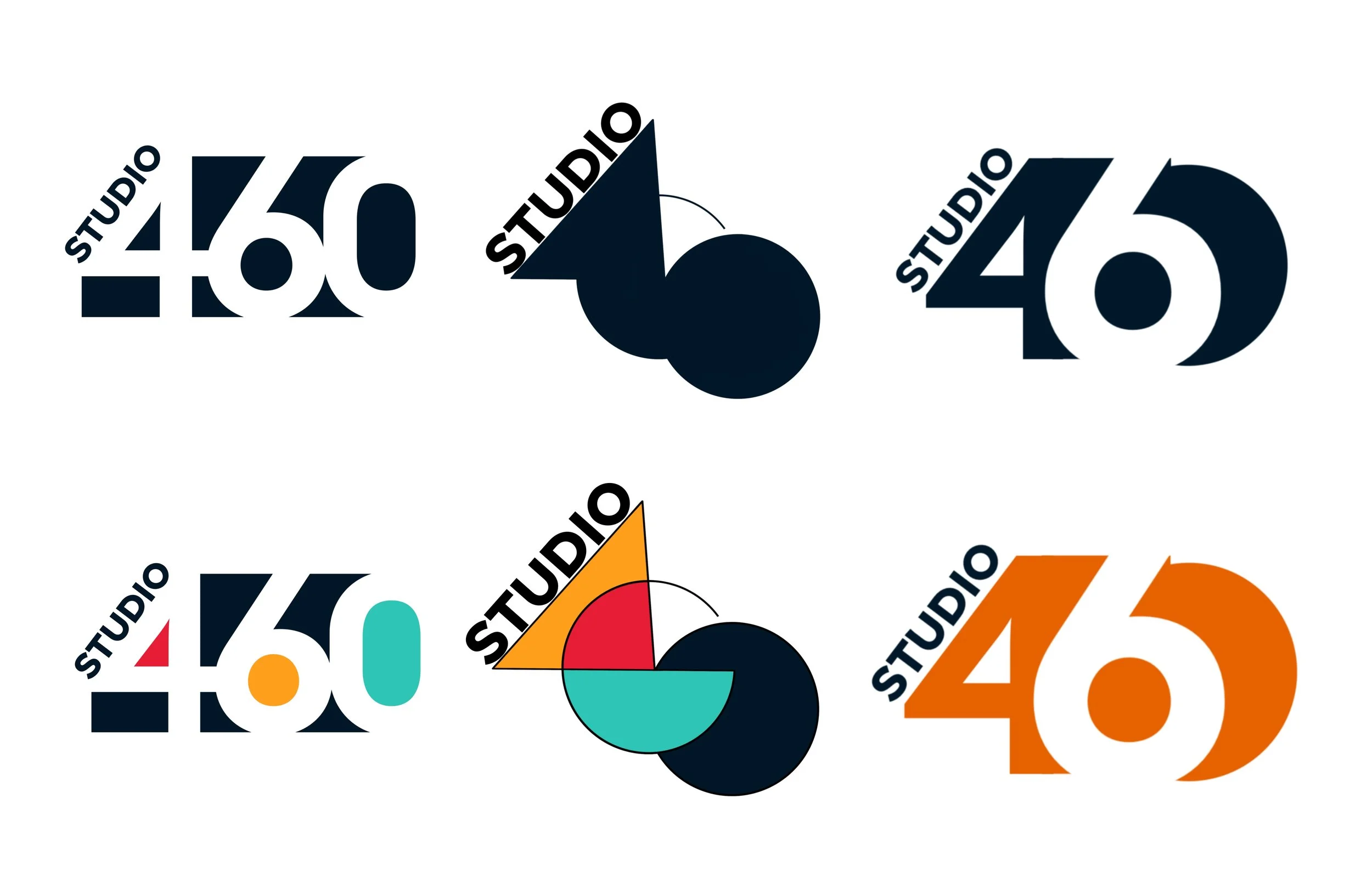
This was the very first logo concept I created in my Student Media Agency class, also known as Comm. 460.
I chose to rename the class as “Studio” instead, since I felt it better captured the creative and collaborative nature of the class. In this concept, I explored different design approaches including color experimentation, negative space, superimposition, and geometric forms to reflect the dynamic energy of the studio environment. The infinity symbol reflects the limitless/boundary-less nature of design potential.
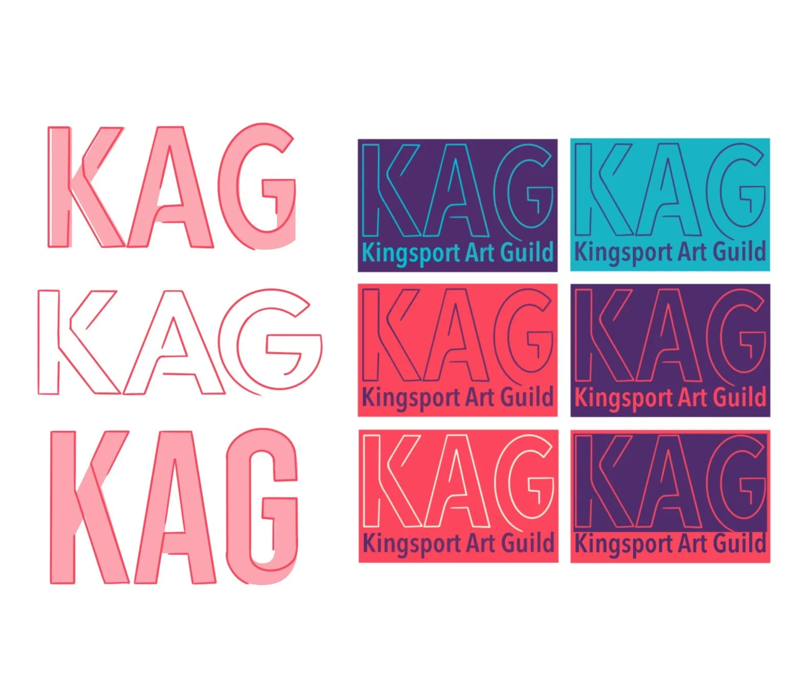
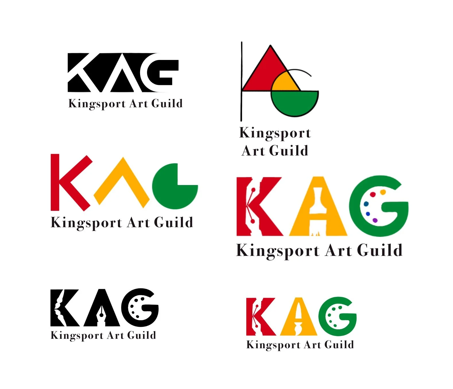
KAG
Client
Kingsport Art Guild
Category
Logo Design
Project Summary
This is a logo concept I designed for the Kingsport Art Guild during my junior year of college. They were looking to update their old logo, which was just their name in a generic typeface, and with no accompanying mark.
The goal was to create something “modern and creative”, yet still “sophisticated and elegant”—something that felt “youthful but not overly trendy.” I explored a few directions that balanced simplicity with freshness. Although they were unsure about which direction to take and the project eventually fizzled out, it was a valuable experience in responding to a real client brief.